Sunday, February 20, 2011

The National Gallery

The type face of the logo for The National Gallery is very classic and simple. It seems to me very plain, but I understand that, because The National Gallery offers such a wide variety or artwork, it has to be a bit generalized. After viewing the collection, I would suggest adding some sort of symbol that represents England to make it a bit more exciting. I would also suggest altering the logo, as seen in many of the other museums we've visted, to make them more colorful and appropriate for those specific exhibits. It also seems a bit odd to me how the words in the logo have been arranged. I think it would look better if "The" was more centered and if "National" appeared larger than "Gallery" because it seems to be more of a key word. This type face doesn't have much creativity in it at all so some aspects of it could definately be improved.
 
In my opinion, the Van Gogh paintings do live up to their position in art history. I never had much of an appreciation of art prior to visiting these museums and seeing the paintings in real life. I thought the Van Gogh paintings were beautiful, but didn't understand the depth and detail that have been put into each one of these paintings. It was amazing to see the paintings up close and to see the brushwork and texture in every painting. I was also intrigued by the different techniques that were used for specific paintings. For example, in A Wheatfield with Cypresses he uses many swirls and a combination of colors that make the painting look abstract. Contrasting this painting, is Long Grass with Butterflies, which mainly uses straight lines and variations of green and it seems more realistic to me and closer to the actual colors in nature.
The object from the collection that would be suitable for my future home is The Water-Lily Pond by Claude-Oscar Monet. This painting is extremely detailed and I was amazed by how the close up detail and brushwork looked so different, and formed a full picture, once I backed up and observed the entire painting. I also find this scene and the colors to be very comforting and soothing. I would put this painting in my future summerhouse in my living room that overlooks the lake.

In my opinion, the color backgroups enhance the paintings. Because of the ornate and bold, gold frames, I feel the colored walls provide a nice contrast for the paintings. However, I do appreciate the white walls in other museums, such as the Tate Modern, because I think they help you to appreciate the painting without being distracted by the color and walls behind it. In the case of The National Gallery, the paitings are all outlined by bold frames that provide a divider between the painting and the wall color and the warm, bright walls help to enhance the beauty and colors in the paintings. I do not necessarily prefer one technique or the other, but I feel that the colors used in The National Gallery are more suited for this collection than that in the Tate Modern.
 
I feel that the use of objects from the collection to create merchandise diminishes the original work of art. Seeing famous works of art all over the place, such as on t-shirts, handbags, and coffee mugs, does not allow you to truly appreciate and get a full sense of the painting. I also assume that an artist would not appreciate their amazing and priceless artwork being displayed on such everyday items. However, I think that there are certain forms of merchandising that are more acceptable than others, such as the use of art work on post cards or printed in text books. This is because post cards are used as a way for people to appreciate the areas and experiences they have had in their life. Textbooks that display works of art are not able to capture their true beauty, but aim at informing the general public about these priceless works of art.
 
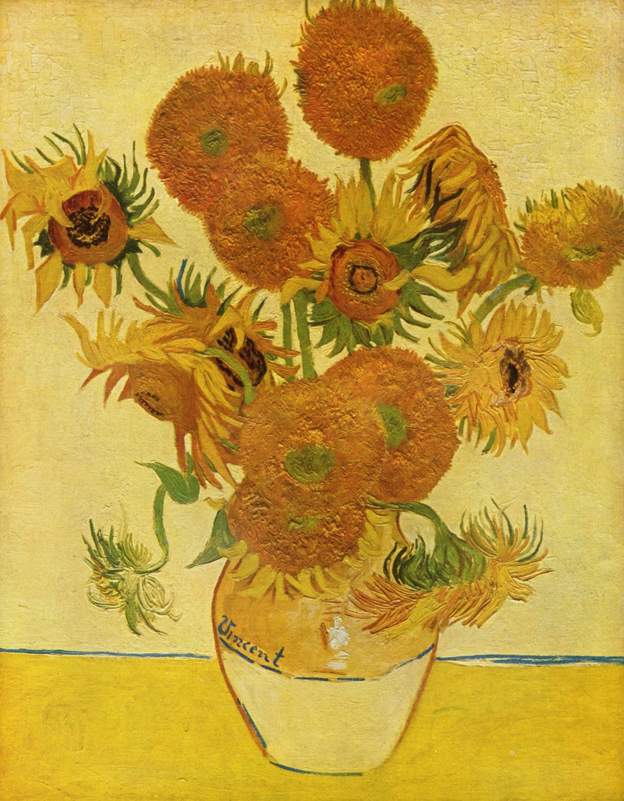
My favorite object from the collections is Sunflowers by Claude-Oscar Monet. This painting was completed in 1889 and is made up of a many dots and details that demonstrates a post impressionalism form of art. I would return to this object for greater contemplation because it struck me as remarkably beautiful with the different shades of yellows seeming to demonstrate a light and happy mood throughout the painting. I had seen and heard about this painting many times, but never fully appreciated it until I saw it in person at The National Gallery. The painting strikes me as abstract and yet realistic at the same time with the different colors and details within the flowers. I would return to this particular piece of artwork because of the amazing detail and brushworks that are visible within the painting.

Sunday, February 13, 2011

Tate Modern

The variations of the Tate Modern logo add to the diverse types of art work that are displayed within the museum. The benefits of the variations of the logo are that the blurred effect adds to the more modern and abstract artwork, while the basic type face is more fitting for simple and naturalistic artwork. Slight variations within the logo emphasize the range of contemporary art and are more beneficial and symbolic than a static type face and logo within the museum exhibits. The use of color among the logo variations also adds to the range of contemporary art and makes the logo more exciting and appealing. Some exhibits are much more fitting for these playful alterations within the logo so it makes sense that the logo is also displayed in a sleek and simple black.
The fact that museums in London are free is a phenomena that we are unfamiliar with in the United States. Museums in the U.S. tend to be very expensive, which means that people are unable to visit them as frequently as people in London can and that they're not as available to people of lower economic standards. This leads to the impression that museums are only for the rich in the United States. Free museum admissions impact the London culture because it allows for the people of London to visit museums much more often and for museums to be an available source of enjoyment for everyone. I think that museums should be free because they provide an experience for people to further their appreciation of art and culture. 


The curator at the Unilever Series exhibit states the following, “Each piece is a part of the whole, a commentary on the relationship between the individual and the masses.” I think the installation of this exhibit provides the answer to the question: what does it mean to be an individual in today's society? The exhibit displays 1 billion porcelain sunflower seeds, which represent the population. It's amazing to see how small the sunflower seeds are, but how much area they covered when compiled together. This exhibit speaks to today's culture of mass production and over-population. It seems to emphasize that we are insignificant or powerless unless we act together. I believe this is true because no major change can be made in the world unless people are willing to work together. I found the exhibit to be rather odd and pointless when I first saw it, but when I read the panel alongside it I was able to further appreciate the artist's depiction of today's society and what it means to be an individual in the world.
The gallery walls remain white throughout the Tate Modern exhibition spaces. The color white enables a neutral field for contemplation of the contemporary and modern art. I would not prefer a break in color, where additional hues are incorporated throughout the museum because I feel the white walls serve to emphasize the art and allow a greater visual experience. I prefer the set up of this museum because the white walls allow for visual pulses from the paintings and artwork instead of being overpowered by color and design as a backdrop for the artwork.


Upon arriving at the museum, I was very surprised to find that the Tate Modern museum is housed in an ugly, overpowering building that resembles the horrid Humanities building at the University of Wisconsin. However, I appreciate the originality and unique design of this museum. Upon entering the museum, you walk into a gigantic room that looks nothing like a museum and then find the escalators, which transport you into a modern, graffiti adorned room. I enjoyed the graffiti painted walls which displayed the names and time periods of artists within the museum. My favorite part of the museum is the top floors, which are surrounded by glass and give you a beautiful view of London. I think this is an ideal building to house a modern collection collection because it is very unique and compelling, the way art should be.

My favorite object from the collections is from a collection of 6 paintings done by artist Gerhard Richter. These paintings are named after John Cage, an American avant-garde composer who was very unique and experimental with his music. These paintings were completed in 2006 and were created by painting sequential layers and then scraping elements of the paint away. I would return to this object for greater contemplation because I found it incredibly beautiful and compelling. My favorite painting from the collection (pictured below) displays an incorporation of bright colors that makes me think of summer. The greens, blues, and yellows remind me of nature and the picturesque summers in Wisconsin. I am also compelled by the rough design of the grays within the picture and how they seem to emphasize the other colors so attractively.

Monday, February 7, 2011

Tate Britain

The logo relates to the more contemporary exhibits in the Tate Britain museum because it is modern and edgy. However, it seems to contrast with the more classic collections, such as the Romantics. The architecture in the Tate Britain museum is also very elegant and dated, which makes the Tate Britain logo appear out of place. The overall essence of the logo is almost eery and mysterious. The logo is incorporated throughout the museum with different colors and fading techniques which help it to appear more universal throughout the collections. The logo presentation at the entrance of the museum is a bit boring and outdated and may be improved with a different type face and a more fitting logo.


Director Nicholas Hytner's Hamlet presents a more modern depiction of the infamous play. In his version of Hamlet, Ophelia is in fact murdered, rather than the more traditional take on the play, in which Ophelia kills herself.  In the play, Ophelia ends up going mad, but doesn't truly carry out her role as well as she could have and win the sympathy of the audience. The tragedy of her life isn't fully depicted in the play, whereas it is obvious in this famous painting by John Everett Millais. This painting depicts Ophelia floating in the water, surrounded by beautiful flowers and greenery. This painting captures the tragic end to her life and encompasses the sympathy that viewers hold hold for Ophelia's appalling life. This painting is most likely the most famous piece of work in the museum because it truly captures the traditional essence of the character Ophelia and beautifully adds to Shakespeare's Hamlet.


The artwork in gallery 11 and gallery 9 is displayed very differently. Gallery 11 consists of more modern and simplistic pieces, whereas gallery 9 displays the salon style hanging of the Pre-Raphaelites. The pieces in gallery 11 are displayed with a very basic arrangement consisting of the artwork by itself without any sort of frame or border. The art in gallery 9 is displayed with very ornate and elegant framing. The two different techniques used for display in these galleries are important because the two types of artwork are very different and it would not be appropriate for them to be displayed in the same manner.


"The Coral Reef" by Mike Nelson was a visually stimulating and intriguing experience for me. It was unlike any art exhibit I have every experienced and left me not knowing what to think. It was a very mysterious and almost depressing exhibit. It seems to be speaking to the flaws of American society and the tragedy that overcomes so many people. The navigation led to the mysterious element of the museum, especially the part where the entrance and exit appeared exactly the same, so it seemed as if we were stuck in the exhibit. This art is completely new to me, but I find it extremely interesting and something that I want to study more closely.

I found the V&A museum experience to be most favorable because I appreciate the more ancient and historical statues and artwork more than modern artwork. I found the architecture and display techniques to be stronger at the V&A museum and enjoyed more pieces there than at the Tate Britain Museum. The navigation at the V&A museum was much clearer, whereas I found myself lost and continually asking for assistance finding exhibits at the Tate Britain museum. I loved the Cast Courts exhibit at the V&A museum because I was able to connect all of those pieces to a particular time and place in history and I don't have quite as strong of a connection with paintings and modern art.


My favorite object from the collections is from "The Coral Reef" by Mike Nelson. "The Coral Reef" was completed in 2000 and was first shown at Matt's Gallery in East London. This exhibit made the biggest impression on me and left me wondering what message the artist was trying to send. The object or room that impacted me most is the blue room with the broken chair. This display seems to speak of drug addiction, heartbreak, and tragedy. There seems to be a story behind this simple collection of items and it made me contemplate what it might be and think of how much drug addiction affects the lives of people all over the world. I would return to this object, and the entire collection in general, because it is a unique form of art that I had yet to experience prior to visiting the Tate Britain museum and because the entire Coral Reef collection seems to have an underlying message within the artwork. In Nelson's words, he wants the viewers to feel 'lost in a world of lost people'.