Wednesday, April 13, 2011

Wallace Collection

1. Labels. Wallace Collection
I feel that the titles and artist names are more integrated with the art when they are engraved upon the frames. In the case of the ornate, gold frames, the titles and artist names fit in perfectly and add elegance to the pieces with the gold labels being on the frames, instead of on the wall beside the picture, distracting from the beautiful wallpaper. For this collection, which is very elegant and over-the-top with bold, gold frames I prefer the titles and names to be integrated into the artwork. However, for other museums with less detailed wallpaper and framing I think object labels are more appropriate.

2. Object of Appreciation. Wallace Collection
I was really captivated by the large rooms of weapons and armour on the main floors. I was suprised to find how beautifully decorated some of the daggers and swords were and by how small the sets of armour appeared to be. This was the largest collection of armour I have ever seen and is something I would go back to observe and look at in closer detail.

3. Object of Excessive details/ornamentation Wallace Collection
I was intrigued by the painting of Venice located on the ground floor of the Collection. These painting caught my attention because of the excessive detail in the picture that captured every ripple of water. I was also able to appreciate this picture because I have been to Venice this semester and am able to recognize the true beauty of the city in that picture. One thing that I did find excessive is the ornamentation of all of the rooms in the collection. At times I found myself much more intrigued by the wallpaper and curtains than by the paintings themself. I feel that in some cases the ornate decorations of the rooms took away from the beauty of the art.

4. Favorite Museum
My favorite museum experience was when we visited the Saatchi Gallery. I loved this museum because of how unique the art was in both style and display. I also really enjoyed the tour guide that took us around the museum and told us about various pieces of art because it helped me to appreciate the art much more than I would have if I had not been informed about it. I was also really amazed by the room that was completely filled with oil. At first sight it seemed like a type of optical illusion until you realized that the oil was reflecting the rest of the room. Looking at an art display like that made me appreciate how much work goes into different pieces of art.

5. Museum Interest
I definately have a greater interest in visting Museums after taking this course. I have never been one to enjoy going to museums before, but this course helped me to appreciate museums, especially in London where they are free, for the true beauty and history that they make available for the public. I was definately intimidated by art before this course, but now I feel that I don't need to be an art expert to visit a museum just to take in its beauty and look around. I also appreciate this course for offering a different perspective for me in terms of branding and design. I would never have payed much attention to the logo or layout of a museum before, but now I find myself critquing different types of type face and thinking of ways that the logo would look more intriguing and creative.
6. Any additional comments
I really enjoyed taking both classes with you this semester Steven! I loved to be able to take your assignments in my own direction and write about things I was interested in. This class helped me to develop an interest in museums that I never thought was possible before because they always seemed so boring to me. Before this class there's no way that I could stare, fascinated at a room completely filled with oil or sunflower seeds and think it was so amazing. Thank you for taking the time to get to know all of us and share your knowledge about graphics and design and incorporate it into the course. I'm looking forward to my independent study with you next semester!

Monday, April 11, 2011

Design Museum

Brit Insurance Design Awards: Your Vote
Architecture: I would honor the Open Air Library because it is an environmental-friendly way to enhance a community's knowledge and society. I really love this idea because I am an avid reader and love to read outside whenever the weather permits me to.

Furniture: I would honor the Sayl Task Chair because because it is a very supportive chair that eliminates the issue of back pain and the flexible material forms to your body. As a student who spends many hours slumped over a desk, I would really appreciate a chair like this because I experience back pain on a regular basis from the hours I spend studying.
Transport: I would honor the Barclays Cycle Hire, Transport for London & Serco. I chose this idea because after living in London, I am amazed by how many people I see riding bikes around the city and through the park. London is a very clean and environmental-friendly city and having these bikes incorporated into city life has helped keep the city clean. These bikes are very affordable and located all around the city so transportation is always readily accessible.

Graphics: I would honor A Love Letter For You. This project is a graffiti love letter that was posted all over cities to brighten people's moods. I love the idea of this and watching the video in the museum made me smile. A video camera filmed these elements of graffiti art all over the place and they were able to beautify many areas.


Wim Crouwel: A Graphic Odyssey

When I walked into the Wim Crouwel exhibition I did not know what to expect or where to begin. There were pictures and graphics all over the room. I found the exhibit minimal and boring. I was soon anxious to venture up to the exhibit on the other floor. I can appreciate that he has made major contributes to the world of design, but I am not very interested in graphics and was not able to understand a lot of his work. I feel that the way his work was displayed was overwhelming and quicking turned me off from further exploration.

When I look at the posters of Wim Crouwel I think of the artists we have seen whose work is very repetitive in its style and incorporates lots of color. The colors of Mark Rothko emerge in the posters with his bright blending of cool and hot colors and Jackson Pollock's splatter-paint art is also familiar in his art with its repitition and vast use of color. The repeated shapes on the wall remind me of the geometric sculptures created my Donald Judd. Wim Crouwel's work is a combination of geometric shapes, colors, and logos that are appealing and creative.

Monday, April 4, 2011

Saatchi Gallery

Sightlines

This gallery enables various sightlines to engage new methods for viewing objects. This museum is unique and unlike any of the others we have visited this semester. It exhibits different works and forms of modern art. The gallery consists of paintings, drawings, sculptures, posters, and even a room filled completely with oil. Because the museum consists of so many diverse art forms, there are various sightlines to view the objects. For example, when viewing a sculpture, the observer can walk around the object and view it from every angle. Another example is the wall full of puerto-rican graves which could be viewed from the ground and from the floor above on a balcony. These various sightlines help the observers to truly get a sense of the artwork. The pieces of art work are also displayed spread out from each other so that you can view one piece of artwork without being distracted by another. The sightlines at the Saatchi Gallery depart from other museum visists because other museums did not have to provide so many different vantage points for viewing art because the art collections were not as diverse. I also found this museum to be much more spread out and minimalistic with the exhibits in each room so that the individual art works could be appreciated without the distraction of another piece.

Didactics

The Saatchi Gallery is unique in that the galleries present minimal text in relation to the art. The purpose for this is so that each viewer can take what the may out of the art, without being pre-disposed to its "meaning" by the text. I like the idea of this and think that viewing art is a personal experience that is different for everyone. However, there were instances where I found it hard to even find the artist's name and think that this is an important aspect to display in text besides the artwork. Other information that I would appreciate is the title of the art work because it gives me a sense of what the artist is trying to portray without completely skewing my judgment of the piece. I would also like to know how the artwork was created because in some cases I am able to further appreciate the art when I know the great length the artist went to create it. An example of this are the two statues we saw in the first room created out of clay, where the artist climbed down through the clay for the "down" statue and up through a block of clay for the "up" statue". I wouldn't have known that was how the piece of art was created unless I had been told and I really enjoyed these two statues, especially after I learned the length the artist went to create them.

Collection

I find the works on view at the Saatchi Gallery more adventurous than museums. There are some works that would not be displayed in a museum, or at least not most museums, such as the work that is a collection of spam advertising. This piece of art work may be questionable in subject matter to some viewers, due to the fact that it questions religion and displays pornographic images, but I find it to be unique and adventurous. This piece of artwork is unlike anything I have seen in museums here in London, but speaks toward a greater cause, which is how all of our needs and desires are targeted through spam mail. I also would never have seen a room completely filled with oil in any other museum here in London and this was also a truly unique experience to me. I think that because this is a modern art museum some of the work is very edgy and unique. I can see how some people would think some of the art is questionable in craft and subject matter, but I appreciate how different the art is and how diverse the collection at the museum is.

Sunday, March 27, 2011

London Graffiti

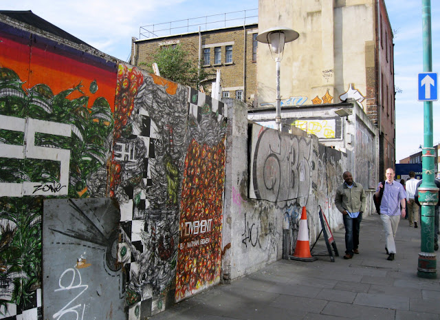
 During my History of London class this week we took a trip to Brick Lane. I had never been to this area before, but was suprised and pleased to find a culturally diverse area full of great art and delicious indian food. Throughout our walking tour, we stumbled across various areas and buildings decorated with graffiti. This particular area, pictured both above and below from different angles, shows a collaboration of graffiti from many different "artists". In my opinion, the graffiti on this street seems to diminish the beauty of the area. It makes the area look almost dirty and unkempt. I can appreciate areas that are completely encompassed by graffiti, but in this case the graffiti looks amateur and incomplete.

 Pictured above is another example from our walk through Brick Lane. I do not like or appreciate the graffiti in this picture. The only sort of meaning that I can decipher from the signage is that it must be someone's name or a group they are involved in. I find this sort of graffiti to learn more towards vandalism because it does not display any sort of element of art. This graffiti just seems lazy and egotistical. I can appreciate graffiti that demonstrates the individual's true passion for art or graffiti that is created to express emotions and make statements, but the preceding picture does not seem to do any of these things.
 The picture above was also taken in Brick Lane. The following graffiti, or street art, is located on a large wall that has various other marks of graffiti, but none as remarkable as the one pictured above. The following image was created by an artist who carved into a white wall to create the image of a man. I think this artwork definately enhances the area. It is located on a boring, old building and was able to transform this plain building into a work of art. It is clear that the artist who created this image is very talented and his work should be appreciated. One aspect of this image that I dislike, is the various graffiti on top of this beautiful creation. These other amatuer graffiti artists seem to be attempting to diminish the true beauty of the initial artwork, but have not been very successful judging by how striking the image continues to be.
On my frecuent excursions over by the National Theatre, my eyes have been drawn to the skate park that is completely surrounded by graffiti. I find the graffiti in this area very intriguing and artistic. This skate park seems to be an area that allows and possibly even encourages graffiti due to the fact that it's in a very busy and well-known area. The graffiti seems to fit with the decor of the area. A skate park is generally an area for people to express themselves and go against the grain of society. I also appreciate how this skate park, with its extensive graffiti, is located directly next to the National Theatre, which is a very classy and popular venue.

Monday, March 21, 2011

British Museum

Our first excursion to The British Museum took place soon after my arrival in London. I was anxious and excited to take one of my first trips on the tube and to witness my first London museum. After a long night out, our trip to the museum was not everything I had hoped it would be. As I looked around at my friends and fellow students I was struck by how exhausted everyone looked. The night before had been one of the students twenty-first birthdays and the sleep deprivation and nausea was apparent in everyone's expressions.

This first trip was led by Brit, our beloved tour guide for our frequent pound trips. The museum was massive and the impressive architecture and the extensive exhibits left me in awe. We toured through room after room, with Brit going off on lengthy tangents about the collections and artifacts. Our first room led us to the Rosetta Stone, where I can say I learned more about the Rosetta Stone than I ever wanted to in my life. Then we were able to witness the statues and artifacts from the Parthenon, something that I didn't quite appreciate at the time but anticipated on my journey back.

Throughout our journey from room to room Brit rambled on and on with her impressive audio guide. She talked so long about everything we were seeing that I was left feeling restless and distracted. I looked around and noticed that many of my fellow students had similar feelings. Students were talking amongst themselves and wandering around distractedly. I also noticed intruders wandering around and listening to our guide which left me more interested in watching what they were doing that Brit. It's not that Brit is a bad or boring tour guide, it's just that not every single artifact in the museum required a ten minute description. The fact that I was too exhausted and lacked my typical attention span that morning aided in the fact that I was not able to appreciate The British Museum on the level that it deserves.

On my second trip back to the museum, I looked forward to viewing the museum artifacts at my own speed and to read the captions and descriptions by myself so that I could be informed of the museum without being bored with it. This second trip was much more memorable and successful. I was able to appreciate the beauty and history of the artifacts without thinking how much I would rather be in bed. I journied through new rooms and exhibits, such as the China and Southeast Asia exhibit and was intrigued by all of the religious artifacts surrounding the room. My favorite exhibit, from both of my trips to the museum, is the mummy exhibit. I have always been fascinated by ancient Egyptian history and stories and ever since I was a kid, I've wanted to see a mummy. The beautiful coffins and portraits left me struck with how beautiful the ancient Egyptians wanted to make death out to be.


What I learned from my two trips to The British Museum is that a guided tour is not my style when visiting a museum. I need to experience a museum at my own level and be able to view items of my own interest instead of listening to lengthy descriptions of artifacts that I do not find intriguing. I appreciate Brit for her extensive knowledge in the material at the museum, but the tour left me feeling bored and anxious to leave. When I visited the museum again on my own I was able to get much more out of it and view many more exhibits. My second visit to The British Museum has left me anxious to return to the museum with my family and sisters and show them the beauty and amazing history that I have discovered there on my own.

Monday, March 7, 2011

National Portrait Gallery

The logo for the National Portrait Gallery is very simple and all encompassing. This gallery exhibits a wide variety of portraits by means of differernt artistic techniques and individuals from very diverse eras. It would be difficult to make a generic type face more creative to fit these diverse portraits, but one thing they could do is make the type face more elegant to meet the status of the individuals pictured there. Another thing that could be done is add some sort of graphic that adds to the concept of a portrait gallery.

This drawing is of the Princess Diana portrait in the National Portrait Gallery. Princess Diana was a woman known and respected around the world. I've edited the picture to resemble myself because I aspire to be like Princess Diana someday. She was a very caring and strong person who did numerous charity work. I also participate in charity work, but would like to make it a larger part of my life when I get older. She was also a very elegant and fashionable person, which is how I hope to be someday.

This drawing is of Anna Wintour from the National Portrait Gallery. Anna Wintour is the British editor-in-chief of American Vogue. She's a very powerful woman who is known for her great eye for new designers and trends. Her face and hair have been adapted to resemble Lauren Cantu. Lauren Cantu is very interested in fashion and not afraid to stand out with new trends. She is also a very strong-willed person who could someday aspire to be the next Anna Wintour.


This is a drawing of the Beatrix Potter portrait from the National Portrait Gallery. Beatrix Potter was a well-known English author and illustrator of children's books, such as The Tale of Peter Rabbit, her most famous book. Potter was also very interested in nature and animals and spent her life on a farm. Her portrait has been adapted to resemble Lauryn Besasie because she's a very maturnal and kind-hearted person. Lauryn Besasie is also the biggest animal lover I have ever met.

This is a drawing of Dame Anna Neagle's portrait in the National Portrait Gallery. Dame Anna Neagle was a very famous English actress and singer. She was a very stylish and dramatic person. Her portrait has been edited to resemble Lauren Rosenfeldt because Lauren is also a very dramatic person who I could see being famous someday. Lauren is also very stylish and has similar physical attributes to Neagle, such as her fair skin and red, flowing hair.

This drawing is of Brian Eno's portrait in the National Portrait Gallery. Brian Eno is a very famous English musician and record producer. He is well known for influencing the music industry with new techniques and musical collaborations. His portrait has been adapted to resemble Karl Iglesias because Karl is also a talented musician. Karl is similar to Eno with his musical innovations and unique style. Someday Karl could aspire to be as famous as Brian Eno.

Sunday, February 20, 2011

The National Gallery

The type face of the logo for The National Gallery is very classic and simple. It seems to me very plain, but I understand that, because The National Gallery offers such a wide variety or artwork, it has to be a bit generalized. After viewing the collection, I would suggest adding some sort of symbol that represents England to make it a bit more exciting. I would also suggest altering the logo, as seen in many of the other museums we've visted, to make them more colorful and appropriate for those specific exhibits. It also seems a bit odd to me how the words in the logo have been arranged. I think it would look better if "The" was more centered and if "National" appeared larger than "Gallery" because it seems to be more of a key word. This type face doesn't have much creativity in it at all so some aspects of it could definately be improved.
 
In my opinion, the Van Gogh paintings do live up to their position in art history. I never had much of an appreciation of art prior to visiting these museums and seeing the paintings in real life. I thought the Van Gogh paintings were beautiful, but didn't understand the depth and detail that have been put into each one of these paintings. It was amazing to see the paintings up close and to see the brushwork and texture in every painting. I was also intrigued by the different techniques that were used for specific paintings. For example, in A Wheatfield with Cypresses he uses many swirls and a combination of colors that make the painting look abstract. Contrasting this painting, is Long Grass with Butterflies, which mainly uses straight lines and variations of green and it seems more realistic to me and closer to the actual colors in nature.
The object from the collection that would be suitable for my future home is The Water-Lily Pond by Claude-Oscar Monet. This painting is extremely detailed and I was amazed by how the close up detail and brushwork looked so different, and formed a full picture, once I backed up and observed the entire painting. I also find this scene and the colors to be very comforting and soothing. I would put this painting in my future summerhouse in my living room that overlooks the lake.

In my opinion, the color backgroups enhance the paintings. Because of the ornate and bold, gold frames, I feel the colored walls provide a nice contrast for the paintings. However, I do appreciate the white walls in other museums, such as the Tate Modern, because I think they help you to appreciate the painting without being distracted by the color and walls behind it. In the case of The National Gallery, the paitings are all outlined by bold frames that provide a divider between the painting and the wall color and the warm, bright walls help to enhance the beauty and colors in the paintings. I do not necessarily prefer one technique or the other, but I feel that the colors used in The National Gallery are more suited for this collection than that in the Tate Modern.
 
I feel that the use of objects from the collection to create merchandise diminishes the original work of art. Seeing famous works of art all over the place, such as on t-shirts, handbags, and coffee mugs, does not allow you to truly appreciate and get a full sense of the painting. I also assume that an artist would not appreciate their amazing and priceless artwork being displayed on such everyday items. However, I think that there are certain forms of merchandising that are more acceptable than others, such as the use of art work on post cards or printed in text books. This is because post cards are used as a way for people to appreciate the areas and experiences they have had in their life. Textbooks that display works of art are not able to capture their true beauty, but aim at informing the general public about these priceless works of art.
 
My favorite object from the collections is Sunflowers by Claude-Oscar Monet. This painting was completed in 1889 and is made up of a many dots and details that demonstrates a post impressionalism form of art. I would return to this object for greater contemplation because it struck me as remarkably beautiful with the different shades of yellows seeming to demonstrate a light and happy mood throughout the painting. I had seen and heard about this painting many times, but never fully appreciated it until I saw it in person at The National Gallery. The painting strikes me as abstract and yet realistic at the same time with the different colors and details within the flowers. I would return to this particular piece of artwork because of the amazing detail and brushworks that are visible within the painting.