Brit Insurance Design Awards: Your Vote
Architecture: I would honor the Open Air Library because it is an environmental-friendly way to enhance a community's knowledge and society. I really love this idea because I am an avid reader and love to read outside whenever the weather permits me to.

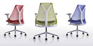
Furniture: I would honor the Sayl Task Chair because because it is a very supportive chair that eliminates the issue of back pain and the flexible material forms to your body. As a student who spends many hours slumped over a desk, I would really appreciate a chair like this because I experience back pain on a regular basis from the hours I spend studying.

Furniture: I would honor the Sayl Task Chair because because it is a very supportive chair that eliminates the issue of back pain and the flexible material forms to your body. As a student who spends many hours slumped over a desk, I would really appreciate a chair like this because I experience back pain on a regular basis from the hours I spend studying.

Transport: I would honor the Barclays Cycle Hire, Transport for London & Serco. I chose this idea because after living in London, I am amazed by how many people I see riding bikes around the city and through the park. London is a very clean and environmental-friendly city and having these bikes incorporated into city life has helped keep the city clean. These bikes are very affordable and located all around the city so transportation is always readily accessible.


Graphics: I would honor A Love Letter For You. This project is a graffiti love letter that was posted all over cities to brighten people's moods. I love the idea of this and watching the video in the museum made me smile. A video camera filmed these elements of graffiti art all over the place and they were able to beautify many areas.
Wim Crouwel: A Graphic Odyssey
When I walked into the Wim Crouwel exhibition I did not know what to expect or where to begin. There were pictures and graphics all over the room. I found the exhibit minimal and boring. I was soon anxious to venture up to the exhibit on the other floor. I can appreciate that he has made major contributes to the world of design, but I am not very interested in graphics and was not able to understand a lot of his work. I feel that the way his work was displayed was overwhelming and quicking turned me off from further exploration.
When I walked into the Wim Crouwel exhibition I did not know what to expect or where to begin. There were pictures and graphics all over the room. I found the exhibit minimal and boring. I was soon anxious to venture up to the exhibit on the other floor. I can appreciate that he has made major contributes to the world of design, but I am not very interested in graphics and was not able to understand a lot of his work. I feel that the way his work was displayed was overwhelming and quicking turned me off from further exploration.
When I look at the posters of Wim Crouwel I think of the artists we have seen whose work is very repetitive in its style and incorporates lots of color. The colors of Mark Rothko emerge in the posters with his bright blending of cool and hot colors and Jackson Pollock's splatter-paint art is also familiar in his art with its repitition and vast use of color. The repeated shapes on the wall remind me of the geometric sculptures created my Donald Judd. Wim Crouwel's work is a combination of geometric shapes, colors, and logos that are appealing and creative.
No comments:
Post a Comment